Ga naar de inhoud
Consumenten
Plannen
Functies
Privacy en veiligheid
Zakelijk
Functies
The Good Cloud vs Office365
Beveiliging en compliance
Diensten op locatie
Back-ups
Demo aanvragen
Over ons
Over ons
Blog
Support
EN
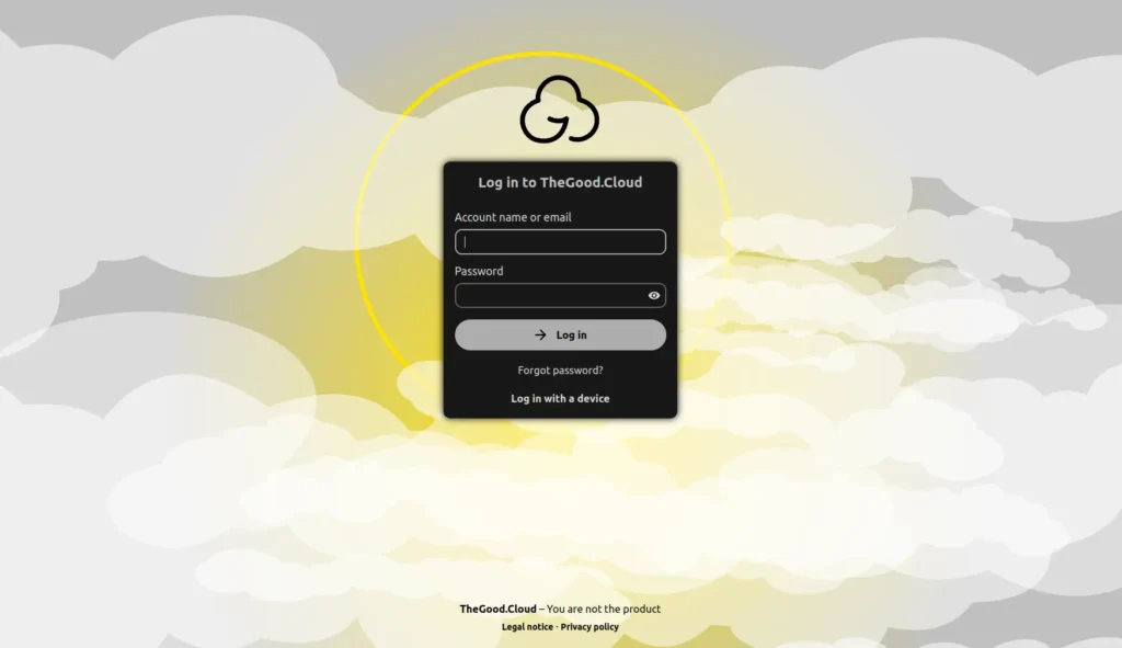
Inloggen
Consumenten
Plannen
Functies
Privacy en veiligheid
Zakelijk
Functies
The Good Cloud vs Office365
Beveiliging en compliance
Diensten op locatie
Back-ups
Demo aanvragen
Over ons
Over ons
Blog
Support
EN
Inloggen
€
0,00
0
Winkelwagen
Consumenten
Plannen
Functies
Privacy en veiligheid
Zakelijk
Functies
The Good Cloud vs Office365
Beveiliging en compliance
Diensten op locatie
Back-ups
Demo aanvragen
Over ons
Over ons
Blog
Support
EN
Inloggen
€
0,00
0
Winkelwagen
Aanbevolen
Big Tech-alternatieven: waarom steeds meer mensen overstappen naar Europese tech
Lees meer →
Blog Artikelen
Blog
Casestudie
Aanbevolen
Het goede dagboek
Updates
Alle
AVG en cloud opslag als zzp'er: wat moet je regelen?
1 juni 2026
De CLOUD Act uitgelegd: wat het betekent voor jouw gegevens in Europa
27 mei 2026
Gehoste vs. zelf gehoste Nextcloud: wat is het verschil?
13 april 2026
Nextcloud hosting: hoe het werkt en hoe te kiezen
13 april 2026
Beste cloud opslag alternatieven (privacy-first & Europese cloud)
19 maart 2026
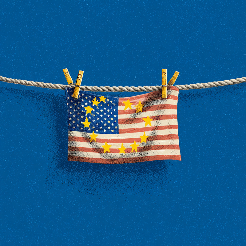
Soevereiniteitswashing: hoe Big Tech doet alsof het Europees is
17 maart 2026
Big Tech-alternatieven: waarom steeds meer mensen overstappen naar Europese tech
4 maart 2026
Casestudy: Future Life Research en The Good Cloud
24 februari 2026
Ethische marketing met Matomo bij The Good Cloud
24 februari 2026
Wijzigingen aan gratis proefaccounts
24 februari 2026
The Good Journal #9 Een zoektocht naar goede AI
4 juli 2024
The Good Journal #8 - Het is niet gemakkelijk om groen te zijn, maar het is onmiskenbaar belangrijk.
4 juli 2024
The Good Journal #7 - Het zijn jouw gegevens, niet hun dataset
4 juli 2024
The Good Journal #6 - Het belang van digitale soevereiniteit
4 juli 2024
The Good Journal #5 Cloudy met een kans op perfecte privacy
4 juli 2024
The Good Journal #4 Zonnig thema
4 juli 2024
The Good Journal #3 Alles upgraden!
4 juli 2024
De goede trucs #1 Dyslexie
3 juli 2024
Laad meer...